Overview
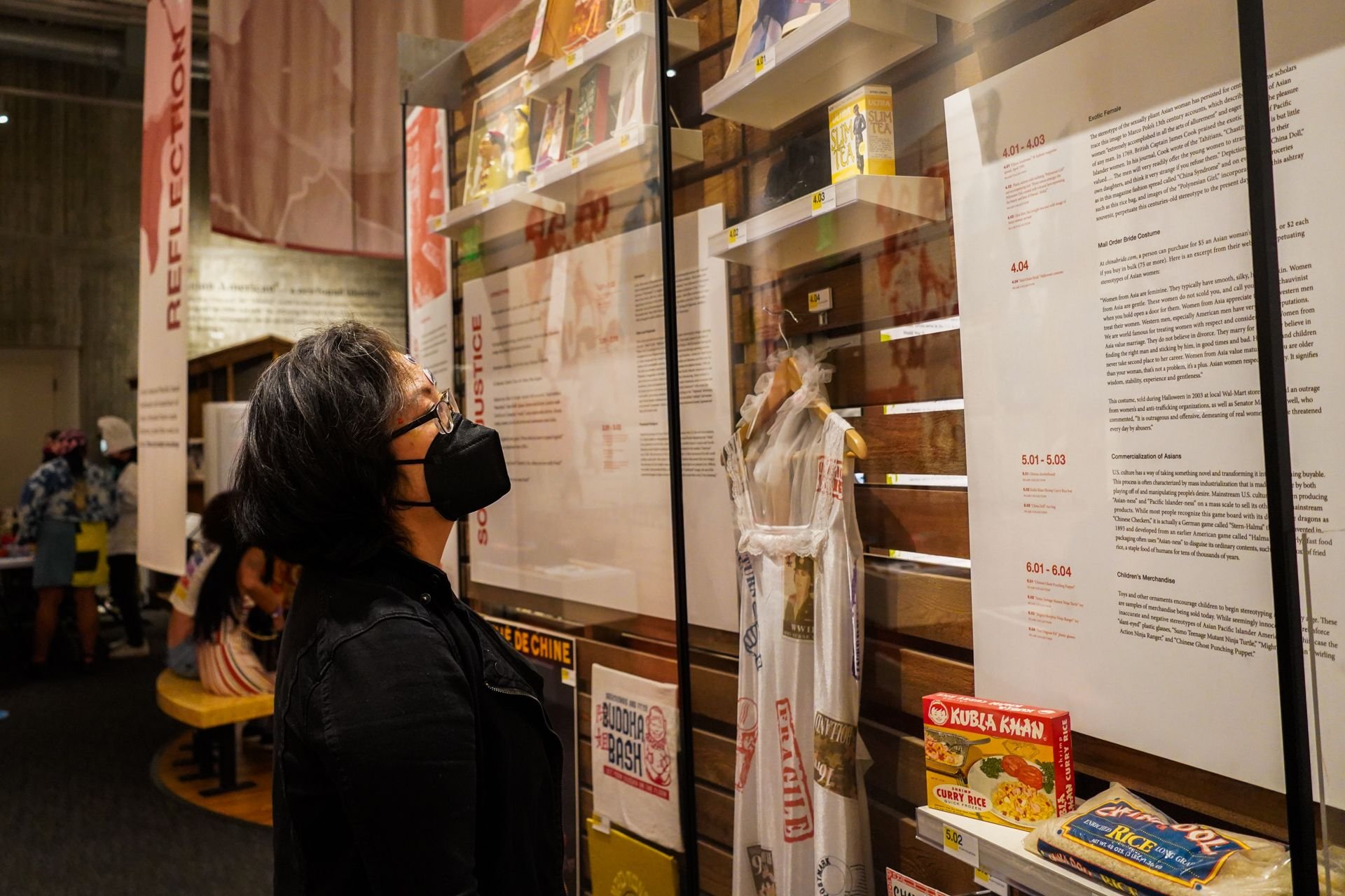
The Wing Luke Museum was founded in 1967 and is located in Seattle's Chinatown-International District. It’s the only pan-Asian Pacific American community-based museum in the United States and became a Smithsonian Institution affiliate and is dedicated to showcasing the culture, art, and history of Asian Pacific Americans.
My Role
I contributed to this project as a UX researcher, leading usability testing by creating the test plan, devising the test script, co-leading virtual testing, and analyzing and synthesizing the data. I collaborated with my teammates throughout each phase of the project, to ideate solutions in line with research findings and presented these findings with museum stakeholders.
Project Duration
5 months
Team
Aaron Yeung - Project Manager
Nicholas Chu - UX/UI Designer
Yasmin Sikavi - UX/UI Designer
Tools
Figma, Maze, Discord, Monday, Google Drive, Zoom, Otter.ai
The Problem
Users currently face significant obstacles in accessing lesson plans and student resources due to broken links and the disconnected nature of the curriculum site from the main Wing Luke Museum website (wingluke.org). This separation creates a disjointed user experience, hindering effective resource utilization.
Teachers want an easy way to navigate educational resources that include differentiated credible sources, organized by grade level and lesson type so that they can save time and provide materials that best support their students’ learning needs.
Goal
The objective of this project was to transfer the Wing Luke Museum (WLM) Curriculum from its current separate platform to the museum's main website. This migration aims to enhance the site's information architecture, thereby making lesson plans and related content more accessible and user-friendly for educators and students. The end goal is to retire the original wordpress platform and complete a full scale migration to the main website on squarespace.
Preliminary Research
Survey Findings
Have you used any resources from museums in your teaching?
Most participants use educational resources from museums in their teaching.
Generative User Interview Findings
What are the key factors you consider when choosing a museum to visit with your class?
Teachers mainly look at the types of tours, interactive exhibits, materials and special events when considering a museum to visit.
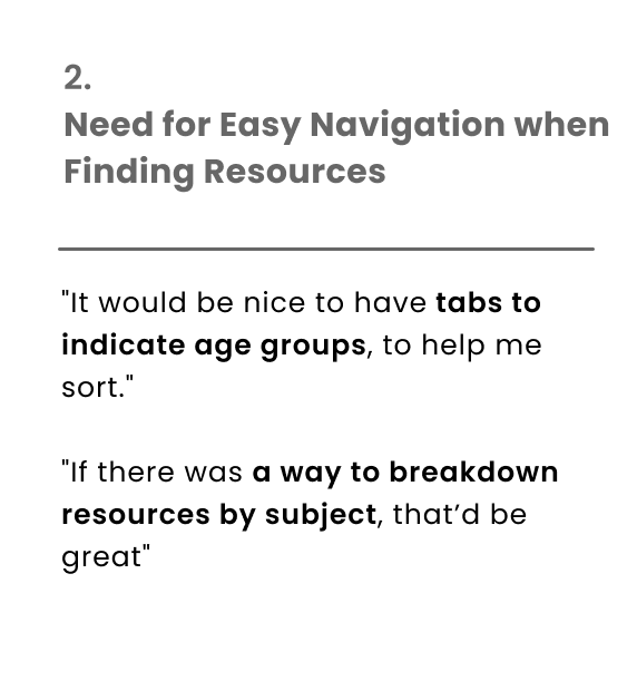
Evaluative Usability Test Findings: Learn Page
Learn Page Design Iterations
The Learn Page serves as the homepage for the education department, therefore its layout as the initial point of navigation for educators is focal. To improve navigation, high priority items for educators were moved to a visual gallery, and the page was shortened to reduce extraneous information and the need to scroll.
Evaluative Usability Test Findings: Video Gallery
Video Gallery Design Iterations
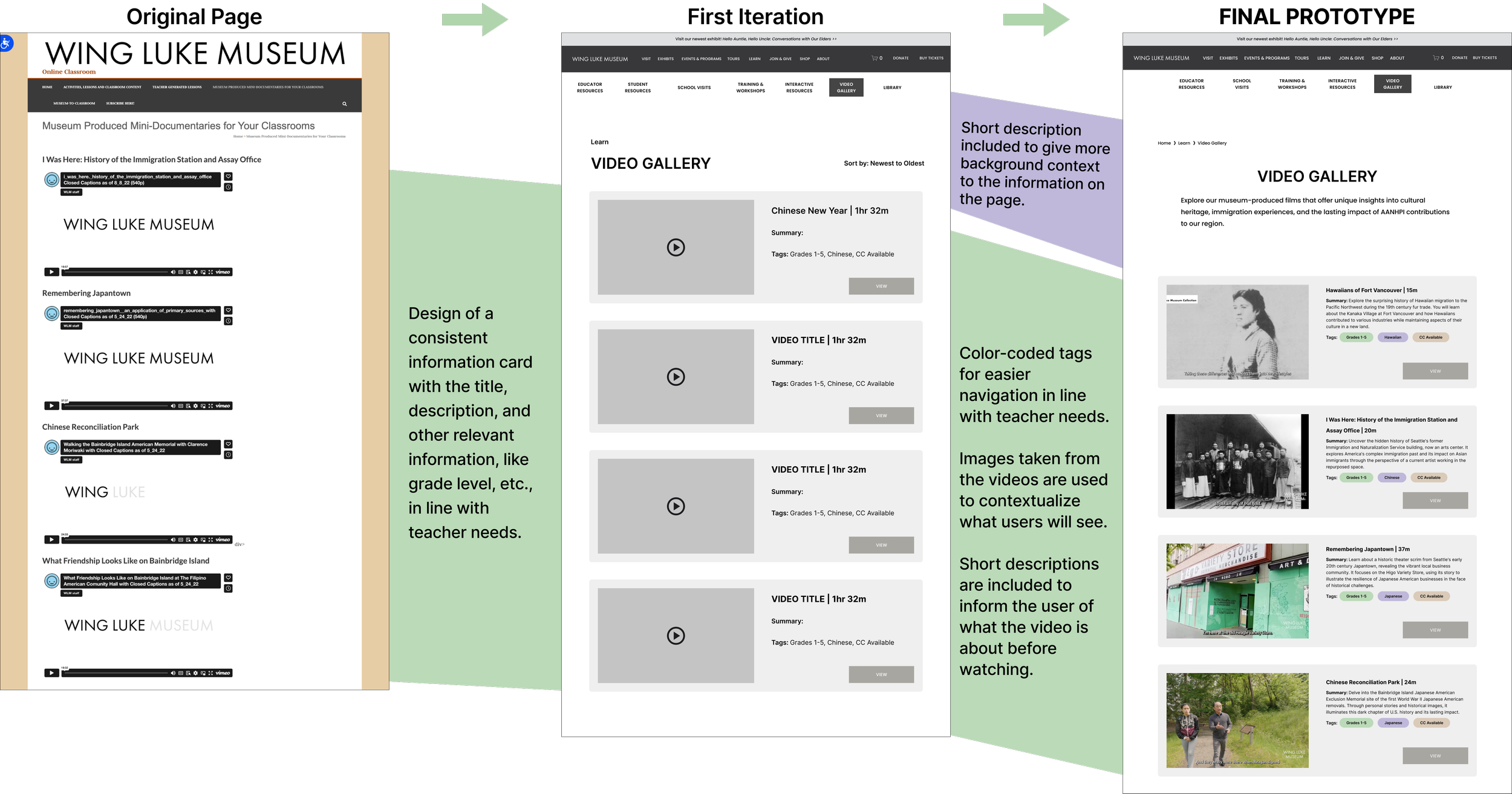
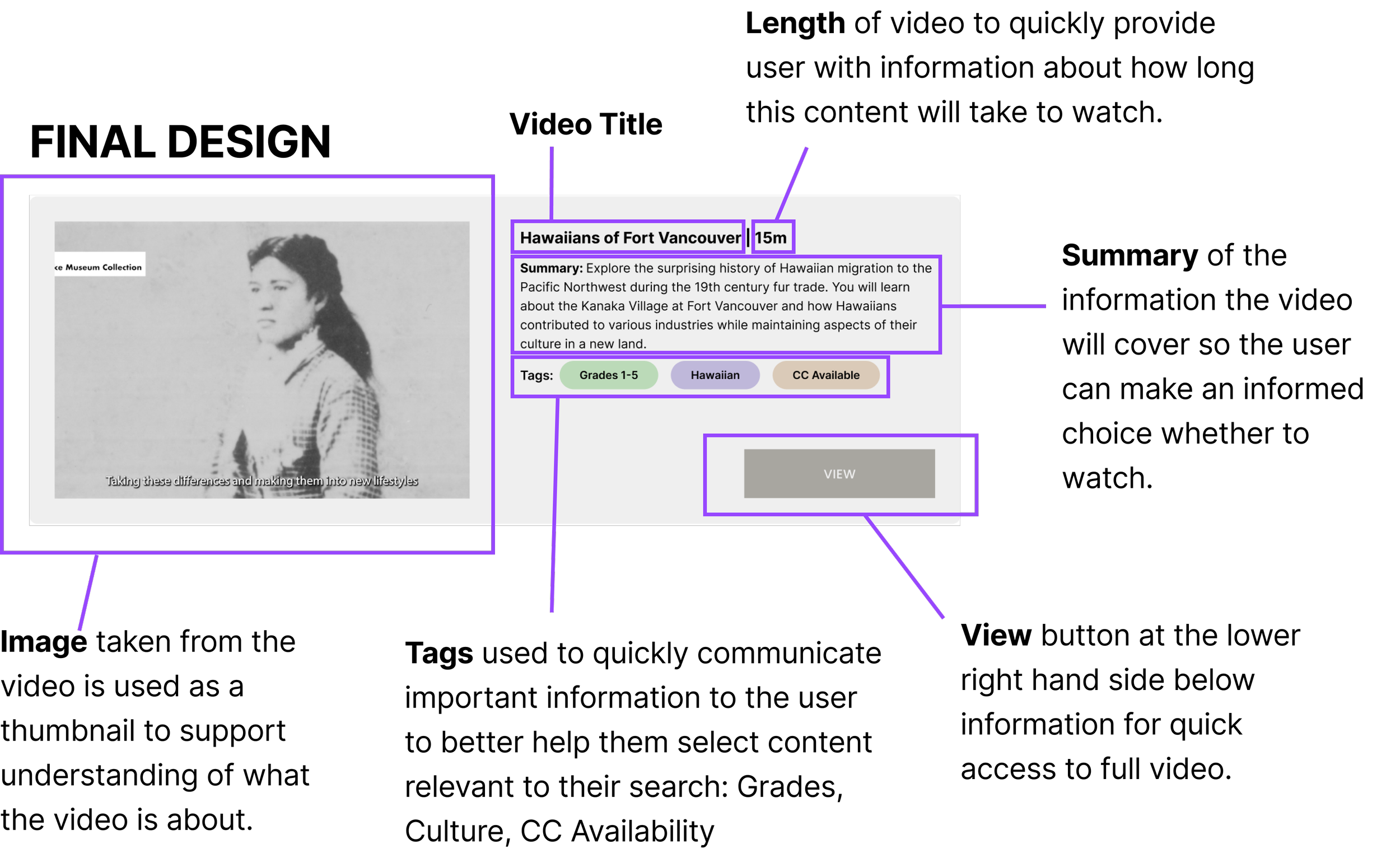
Findings from the discovery phase highlighted frustrations around lack of information about documentary videos before watching them. In the redesign, a card design was created for consistency across videos, and visuals and descriptions were included to provide context to influence video selection.
Video Gallery Card Design
Evaluative Usability Test Findings: Curriculum Page
Curriculum Page Design Iterations
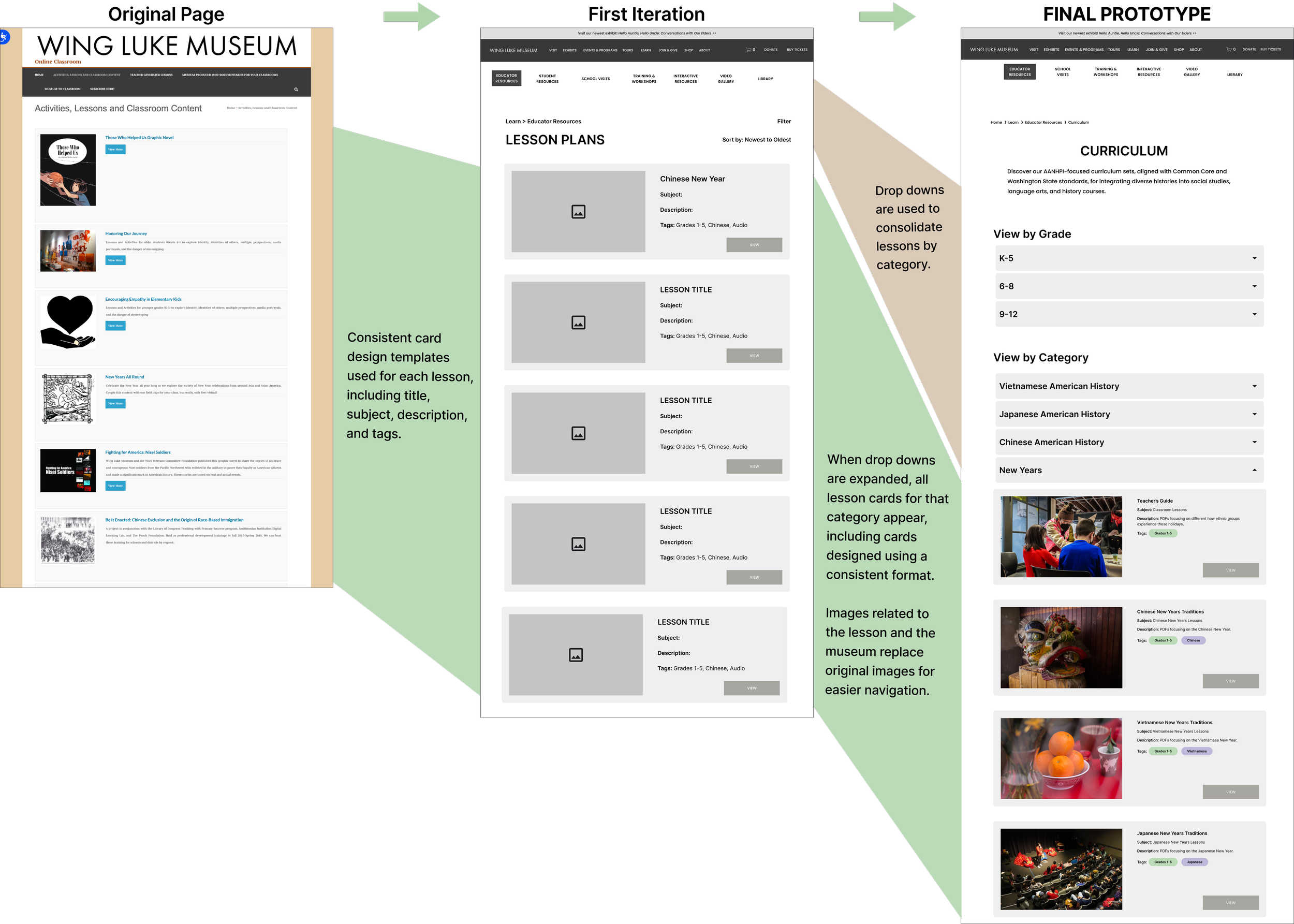
A filtering system using a series of categorized dropdown menus were designed to accommodate the user’s need to find lessons by category (grade, topic), and accommodates the limited filtering features available on the Wing Luke Museum’s website platform. Repeated card designs, additional sorting features on the cards, and relevant images are included for easier navigation.
Lesson Card Design
Lesson Page Design Iterations
The original lesson page designs did not have consistent formatting across lessons. With this design, we included clear sections with information important to teachers that include links for easy location and access to the most pertinent information a user is searching for. Since teachers search for different lessons and materials focusing on topic or grade, we also included a section at the bottom with recommended relevant lessons for efficient navigation.
Sitemaps
Current State Sitemap: Education Section
Confusing navigation with certain links opening to different servers outside the main website server.
Too many unorganized navigation options that require simplification.
Many pages are difficult to navigate to due to how many there are and how deeply buried they are.
Proposed State Sitemap: Education Section
We re-designed the global navigation in line with user research findings for more efficient discovery and navigation of content and materials for teachers on the “Learn” page.
Suggestion
Color Accessibility: Web Content Accessibility Guidelines (WCAG) require a contrast ratio of at least 4.5:1 for normal text and 3:1 for large text to achieve Level AA compliance. Throughout this project, accessibility was top-of-mind. When it came to suggesting changing the colors of the buttons based on findings from usability testing, in which participants shared that the grey buttons are sometimes hard to see and don’t seem like functional buttons, we understood this required a deeper conversation around the museum’s branding guidelines. This is a design recommendation we handed over to the education department of the Wing Luke Museum and the communications team to review and eventually implement with future branding changes.
Conclusion
While user research helped define what teachers were specifically looking for when using the Wing Luke Museum website as a resource for their classroom, which helped my team narrow down how to design the website navigation in line with filtering for these needs, another important aspect of this project was collaborating with stakeholders. My team held various meetings with the Wing Luke Museum team to ensure the progress with our design iterations accommodated the museum’s needs, and was feasible to implement on the backend (especially when it came to filtering information). Although next steps include improving accessibility by making the color themes compliant, the designs implemented in this project successfully improved target user discovery and general navigation that helped the museum stakeholders better understand their end users. We also found that too much information leads to user abandonment and fatigue, resulting in my team cutting a lot of redundant information where users shared it didn’t make sense, and we kept and optimized redundant information that was effective. We found that redundancy doesn’t equate to adding to complexity, rather if done well, it offers users more opportunities to complete their goals.


